Introduction
One of my many interests is photography. After a longer break, I'm trying to dedicate a little more time to this hobby again.
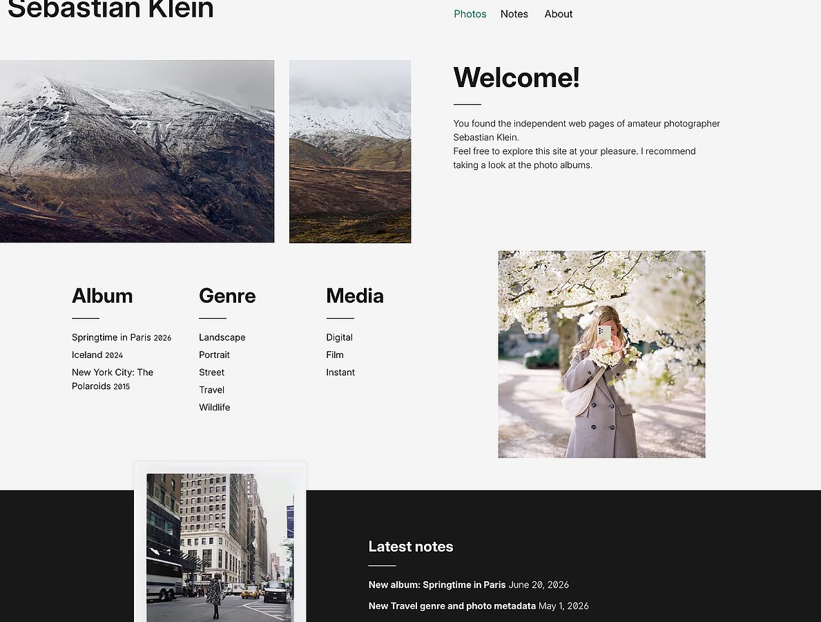
At the beginning of March, I launched a new website to showcase some photos:
www.sebastianklein
My first post on the photography blog describes the website from a content perspective. Today, I'll focus on design and frontend technologies.
The impetus
I attended the beyond tellerrand conference in Düsseldorf in May 2025, which featured two interesting frontend talks: “Modern CSS for Creative Developers” by Cyd Stumpel and “Painting With the Web” by Matthias Ott.
What I learned from the two presentations, among other things:
- The latest web features and APIs are powerful tools
- To fully benefit from these new capabilities, web developers (and designers) should try them out in the browser and gain experience with them
Based on a long list of the latest CSS features, I then created various small demos. From the very beginning, the plan was to apply as many new technologies as possible to a real-world project—the photography portfolio.
Before we get into the technical aspects, let's take a quick look at the site's design.
Design considerations
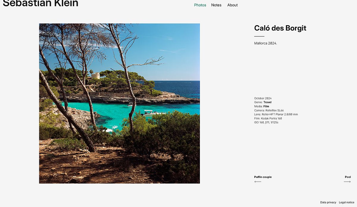
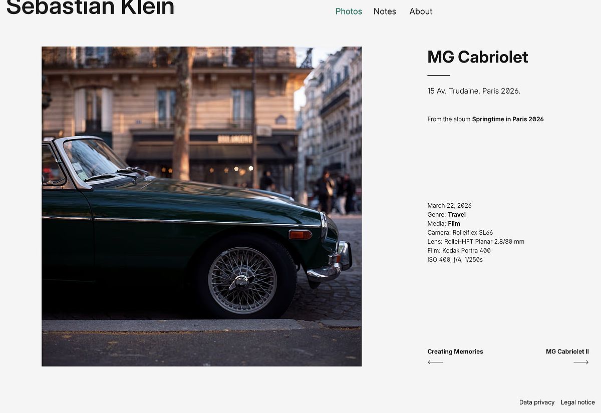
My guiding principle in designing the page was: The photos must take center stage.
This led to three key decisions:
- The intentional use of white space
- Limiting the color palette to black and white, plus a shade of green for emphasis in the navigation
- Typography that is appealing but not distracting
An exception is the individually designed photo albums, where I allow myself more creative freedom.
Everything flows
I wanted to create a flexible layout that utilizes the available viewport. Only the blog's content area has a fixed width.
I usually position the elements on a page using a CSS Grid. Spacing and element sizes increase with the viewport width. Since images have a maximum size, additional white space becomes visible depending on the screen size. These asymmetries are not flaws, but rather intentional.

Fullscreen sections
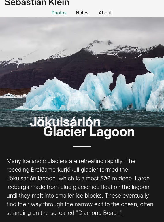
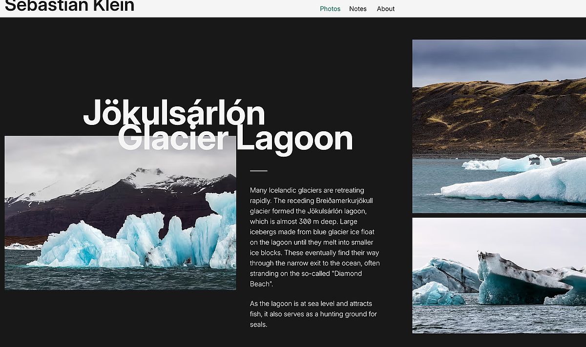
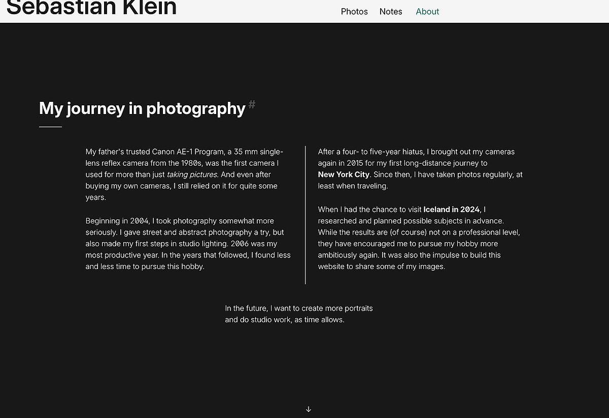
Some pages are divided into sections, each of which is (at least) the size of the viewport. Their content is vertically centered within the viewport. These include the photo detail views, the Iceland album, and subpages such as “About.”
The sticky header is subtracted from the height of each section. The last section automatically leaves space for the footer, so you don't have to scroll again to reach it.
My intention was to structure the content clearly and allow users to scroll through it section by section (see scroll-snap).
Grids! Grids! Grids!
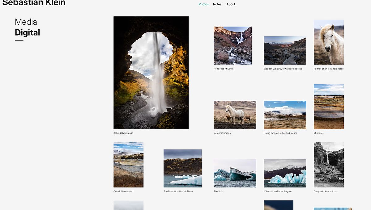
The intended design gave me plenty of opportunities to configure different CSS grids and experiment with the associated CSS properties. The Iceland album alone features six grid variations that adapt multiple times via media queries.
I experimented a lot with an idea that I couldn't get out of my head: Is it possible to combine a classic design grid—for example, one with 12 columns—with layout breakouts? As it turns out, it works: CSS Layout Breakout with multi-column grid
(I'm confident that I'll get around to writing the second part of the tutorial soon sometime. We'll see.)
View Transitions
The View Transition API enables animated transitions between two screens. This applies to dynamic changes on the current web page and to navigation between two pages.
Three lines of CSS is all you need to set up a global fade effect:
@view-transition {
    navigation: auto;
}
In addition, I've used the view-transition-name property on images. When I click an image with this property and open its detail view, the image transitions from its starting position to its destination position, moving smoothly into place on the page that opens. The only requirement is that the view-timeline-name property on the image must be identical on both pages.
View Transitions offer many more technical possibilities, especially when used in conjunction with JavaScript. Multiple elements can be animated in different ways during a transition, as this demo shows: https://live-transitions.pages.dev
When I find the time, I'll add a nice transition between two consecutive photo detail views.
scroll-snap
As explained above, some pages are split into sections, each filling the screen.
However, the planned scroll-snap feature doesn't work with the sticky header and footer. This creates two separate vertical scrollbars, which stops the feature from working. I'll add this to my list of improvements.
Variable font with OpenType features
I chose the brilliant Inter Var as a web font. Using CSS font-feature-settings, I customized the glyphs to my preferences: ss01 for alternative digits, zero for a slashed zero, and ss08 for square quotes.
The font also includes several long arrows as special characters, which I use in the photo browse navigation. On hover/focus, the arrows are subtly animated by adjusting their weight, as are the titles in the main navigation.
Magic Numbers, or: fighting against optimizations
I like to hide small easter eggs on my personal websites. For example, if you look closely at the portfolio's stylesheets, you'll notice recurring numbers for sizes or opacity, like “66.” It references the SL66 camera model and the 6×6 medium format.
The lines below the headings have a width of calc(24px + 36px), which corresponds to the 35mm film format (in mm). This small hint wasn't easy to implement, because as many as three different tools in my build process optimized this calculation to the result of “60px.”
Ultimately, I convinced Dart-Sass, cssnano, and Vite to keep this calc() function. It took a lot of effort for such a minor detail, but eventually, it became a matter of principle. I also gained deeper insight into my chosen toolset.